

TK Maxx Transactional Email Redesign
TK Maxx embarked on a migration to a new email service provider, Zeta, which utilizes a component-based template system. I played a pivotal role in designing and developing the new transactional email layouts, leveraging the platform’s capabilities to create visually appealing and effective customer communications.

A Fresh Look for TK Maxx Emails
Enhanced readability: Clearer typography and improved layout for easy comprehension.
Improved accessibility: Adherence to accessibility standards for inclusivity.
Consistent branding: Stronger alignment with TKMaxx’s visual identity.


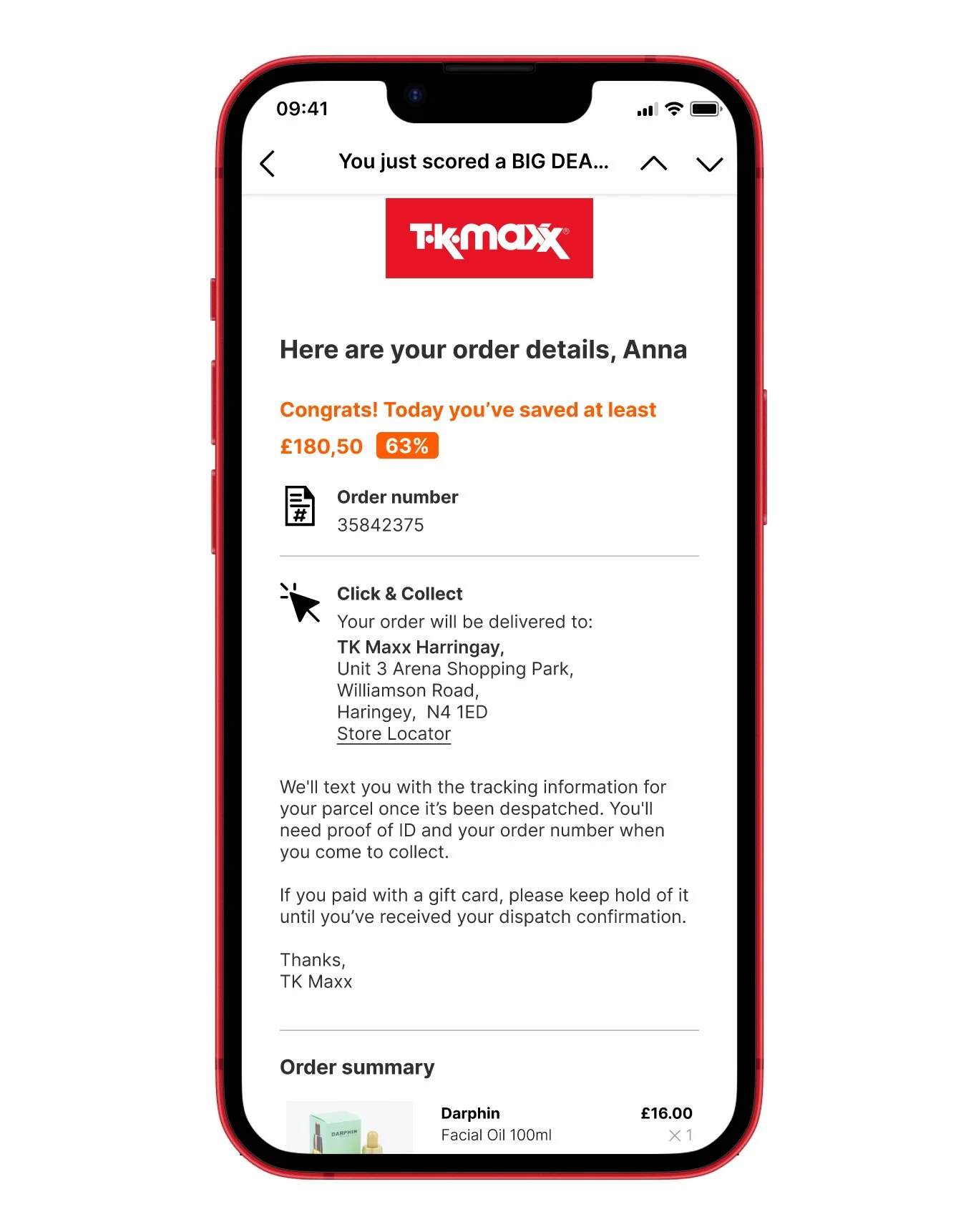
New Layout
New Layout
Graphic Improvements
Enhanced Accessibility: Improved font choices, sizes, and colors for optimal readability and inclusivity.
Standout Buttons: Redesigned buttons with clear calls to action for improved user engagement.
Prioritized Information: Crucial information is prominently displayed at the top of emails for quick comprehension.
Visual Hierarchy: Enhanced layout and organization of content for better visual flow and clarity.
Consistent Branding: Strengthened brand identity through cohesive design elements and color palette.
Responsive Design: Optimized email layout for seamless viewing across various devices and screen sizes.
Informative Icons: Clear and relevant icons enhance understanding and visual appeal.
Concise Copy: Streamlined text improves readability and focus on essential information.
Balanced White Space: Effective use of white space enhances overall design and readability.
Colours


#303030
#000000


#E71324
#FF5C00
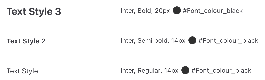
Typography

Inter font
Icons


Old Email Layout


Competitor Analysis
